
Challenge
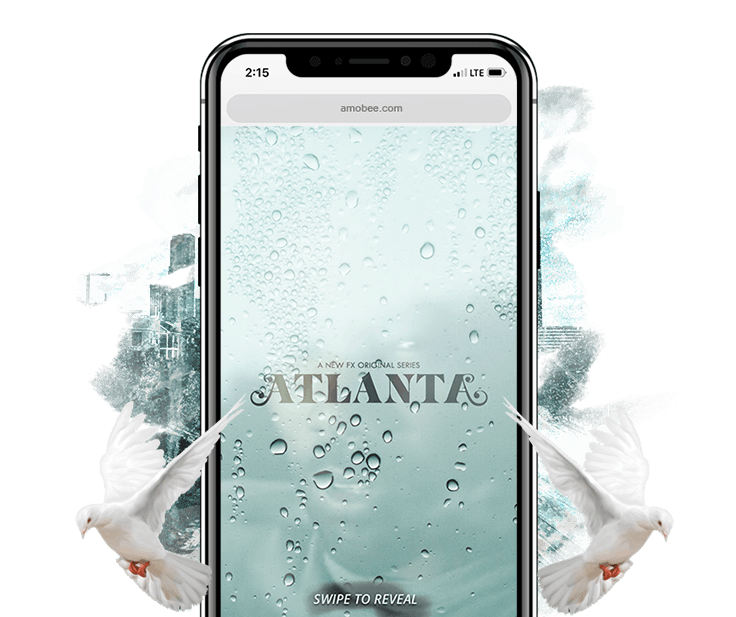
Create new ways to get fans to engage with vertical video trailers for the second season of Atlanta.
Solution
Trailers that play after users complete gamified challenges that fit the themes of the new season.
Traditional linear TV is becoming a more interactive experience as viewers can watch on different devices and can interact with others in real time while watching live. We wanted to capitalize on the changing landscape for TV using the principles of gamification. Below are our two initial concepts.
Game 1
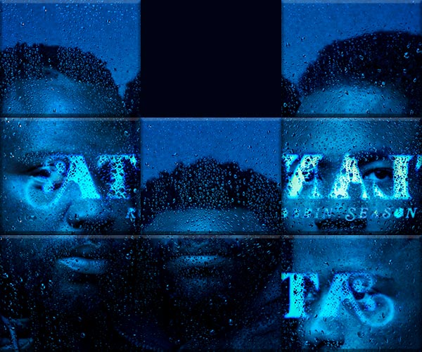
A sliding block puzzle
Game 2
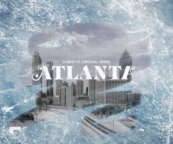
A “scratcher” style wipe reveal

01
Show a simple puzzle

02
On puzzle completion
play teaser

03a
Click out to full trailer

03b
Show cinemagraph
endcard with playtimes
and show details
Season two’s surreal winter setting lent itself to the “scratcher” concept. Once 60 percent of a foggy windshield overlay was wiped away, it faded out and the teaser would play.
IAB guidelines require autoplay videos to start on mute but because this video plays on a user interaction we could play the teaser with sound as the default while still keeping the option to mute.
IAB guidelines require autoplay videos to start on mute but because this video plays on a user interaction we could play the teaser with sound as the default while still keeping the option to mute.
Rich media ads have granular data on how they are being interacted with by end users. We wanted to combine these insights with some qualitative results from internal usability tests on the Atlanta wipe reveal experience to see how we can better design advertisement user experiences.
User’s browsers blocked the video
from playing on reveal.
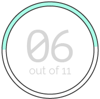
User’s watched the full
teaser before closing the ad.
Our testing confirmed that gamification can make a video experience more engaging but more importantly it showed us the obvious; close buttons and play buttons are going to be the most used touch points in an advertisement. This is often overlooked because these aren’t usually considered drivers of “performance” when measured by click through rates.
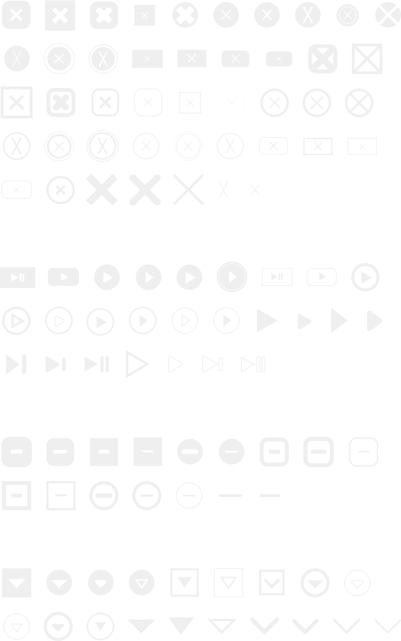
We felt designing an icon font of basic ad UI elements would give us an easy starting point to iterate off when designing. Phase two of this project will be to make the font open source allowing for contributors across the ad tech industry and to define universal guidelines for using these essential UI elements.