The Basics
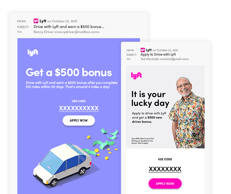
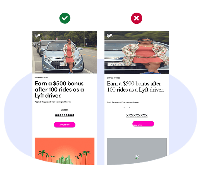
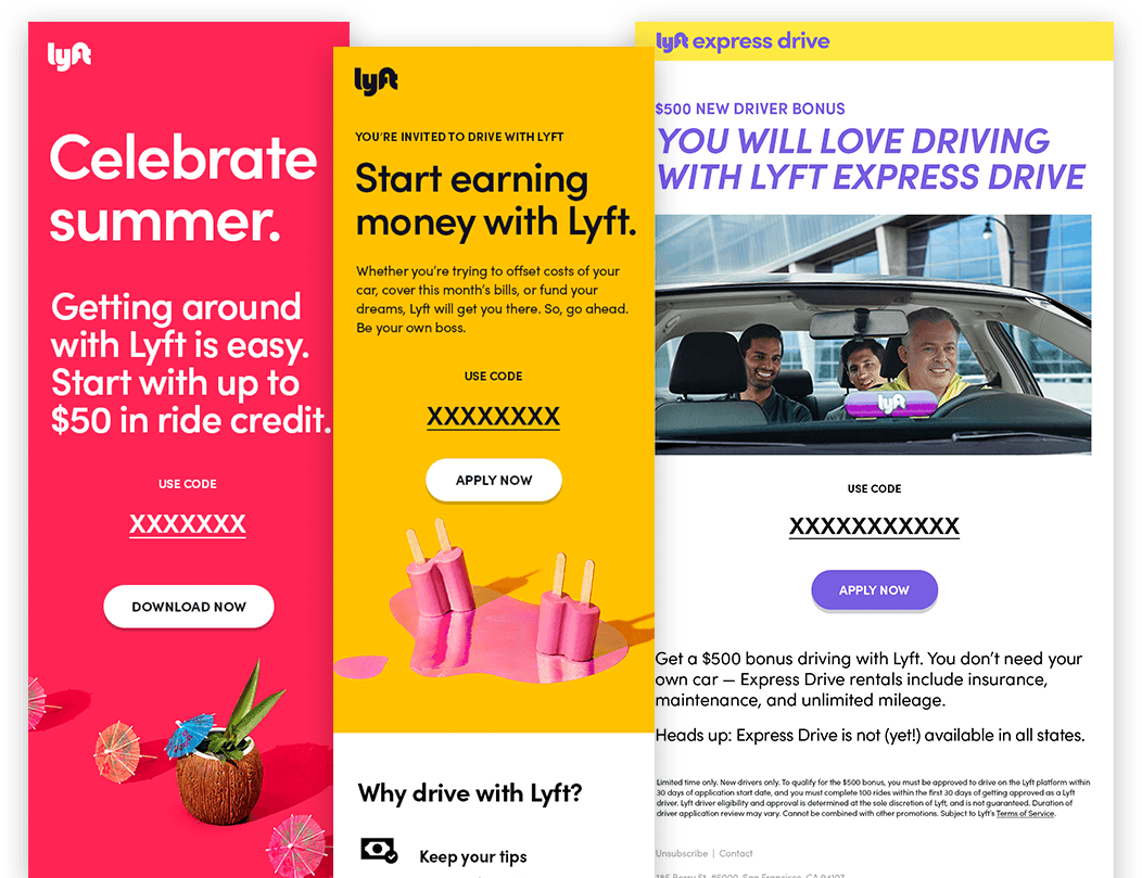
Basic email HTML has the infrastructure to make updating color and copy easy. However, we had to design and test new fallbacks for typography, spacing, and buttons. Below are a few components we designed and developed.
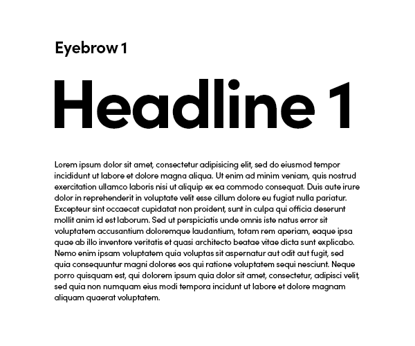
Type
A boilerplate with a style tag that imports the Lyft Pro san serif
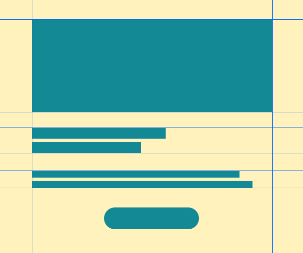
Spacing & Layout
Hard coded spacers for consistent layouts

Bulletproof Buttons
The easiest way to implement buttons in email is to use images, but we wanted to make sure our emails were as close to being ADA compliant as possible. Bulletproof buttons provided us with the code to ensure our buttons can be read by screen readers but we added in image buttons as fallbacks for more consistent renderings in Outlook.
2x Images
We wanted to ensure all of our imagery looked sharp on high density pixel displays, so we used the following hack to force 2x images to work across all email clients.